
There have been minor news nuggets coming out of the U.S. Olympic Camp in Arlington, Va., but one of the more notable events to take place was the unveiling of the 2014 Olympic jersey.
And here’s the first look, via Nike PR.

The jerseys were designed by Nike and with the USA shield featured prominently on the front, this is a bit of a nod to the jerseys of the 1930s and 1940s.
I think there’s a few gripes here. One is the letters U.S.A. are not featured as prominently as in more recent jerseys. That said, the large shield, with the unmistakable red and white from the American flag along with the blue at the top, to me is quite strong.
The shiny stars are overkill to me, and probably unnecessary. No, definitely. I think you take those away and you have a better jersey overall.
The white jerseys have that shoulder-pad design which I think might take some getting used to, but it’s an interesting look. I think it makes the jersey look unbalanced and don’t love them, but I wonder how they’ll look on the ice overall. again, the stars distract and are not great.
The blues I think, again aside from the stars, are fantastic. That shade of blue is perfect and the shield really pops on the jersey. The overall design brings back the 1930s look, as seen here.

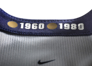
The weird matted tie pattern under the collar on both sides is a little weird, but I think that will be featured on all of the team’s jerseys as Russia’s recently released threads had the same thing. Don’t like it, but that’s going to be a problem on all the jerseys.
Here’s more of the technical facts about the jerseys and some background, via USA Hockey:
The 2014 Nike USA Olympic Hockey Jersey fuses USA Hockey’s rich history and tradition with the performance needs of today’s athletes. Decades of design delivered the inspiration to create a lightweight jersey with distractions removed and range of motion maximized.
The jersey draws inspiration from the pride of competing for Team USA by amplifying the American Flag aesthetic through matte/shine stars on the shoulders and bold striping. The patriotic and inspirational message “Land of the Free, Home of the Brave” can be found on the inside neckline.
The USA Hockey Crest has been enlarged and refined to reflect the 80’s aesthetic, while the right sleeve pays homage to gold medals in 1960 and 1980.
-
Nike Flywire reinforces the neck area while providing a closer fit to prevent slipping. The aesthetic also provides a nod to the traditional lace neck design.
-
Reduced seaming eliminates weight and creates a more traditional blocked look.
-
Recycled polyester embraces sustainable innovation without compromising performance. Each jersey is made from about seventeen plastic bottles and the socks use approximately five plastic bottles.
-
Lightweight premium letters and numbers shave off unnecessary weight.
-
Zoned ventilation and articulated sleeves for ventilation and maximum range of motion.
-
Stretch open hole mesh under arm for added ventilation.
Some of the more likable elements from the jersey are its most subtle. On the inside of the collar, the United States’ two gold medal victories are honored. Since it’s not on the outside, it’s really only a reminder to the players, but a nice one. It’s also symbolic of carrying that legacy with them onto the ice, which is nice if you’re into that sort of thing.
Lastly, if we’re going to be so upset about the stars, and I agree that most of us are… it could’ve been worse, right 1976 Canada Cup team?

You may hate them America, but they’re yours now. Share your thoughts in the comments.


All they need are some swarovski crystals!
not a fan of those jerseys! They took a classic look and tried a bit to hard to make it look modern. The stars are for sure overkill! I don’t see myself buying a 2014 olympic jersey anytime soon. However, I will be cheering them on throughout the olympics, wearing my 2010 olympic jersey!
Reblogged this on Sports Equilibrium.
Pingback: PHOTO: 2014 USA Hockey Olympic Jersey Unveiled | The United … | Radio Slot Network
This is the physical version of pop singers “personalizing” the National Anthem. It’s just as bad and just as embarrassing. Thankfully, there will be something different in four years. I just hope that Nike never gets the NHL contract, because I couldn’t stand to see this sort of thing 82 games a year. I thought that the Reebok Edge was bad; these make those look “classic” by comparison.
These are awful. The shield looks like either the K-Swiss or the Union Pacific logo. Combined with the fake laces and the sparkly stars, this just tacky.
Travis Hughes, over at SB Nation, posted a photo of a reworking of this jersey that is actually not bad.
Too bad an unpaid fan can come up with a better design than Nike’s professionals.
ESPN’s Olympics page showed a picture of the gold medals inside the collar with the size underneath, where it also says the jersey was made in Canada.
Why am I not surprised?